Color Combinations Style Guide
Complementary, tonal, and neutral pairings, plus how to pick colours for your skin tone and occasion.
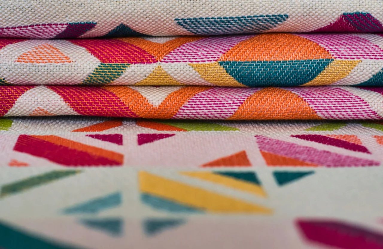
Colour is the first thing anyone notices about an outfit, long before they clock the cut or the embroidery. Getting the combination right can make a modest lawn suit look expensive and a costly lehenga look flat. This guide breaks down the colour pairings that consistently work in desi wardrobes, why they work, and which occasions each one suits.
The short version
- Most flattering combinations follow one of a handful of colour relationships: complementary, analogous, monochrome, or neutral-plus-accent.
- Warm tones (rust, mustard, maroon) read festive and grounded; cool tones (teal, ice blue, emerald) read elegant and calm.
- Skin tone and occasion matter more than any trend: pick undertones that flatter you and saturation that fits the event.
- When in doubt, keep two colours dominant and let a third act only as a small accent through jewellery, dupatta, or shoes.
How colour combinations actually work
Behind every outfit that looks "put together" is a simple colour relationship, whether the wearer planned it or not. Designers borrow these relationships from basic colour theory, where hues are arranged on a wheel and their positions describe how they interact. According to the widely referenced colour scheme framework, the main harmonies are complementary (opposite hues), analogous (neighbouring hues), monochromatic (one hue in many shades), and triadic (three evenly spaced hues).
You do not need to memorise the wheel to use it. The practical takeaway is that pairings feel intentional when the two colours have a clear reason to sit together: either they contrast sharply, they blend smoothly, or one is a quiet neutral that lets the other lead. Combinations go wrong when two loud, unrelated colours fight for attention with no neutral to break the tension.
Complementary pairs: high contrast, high impact
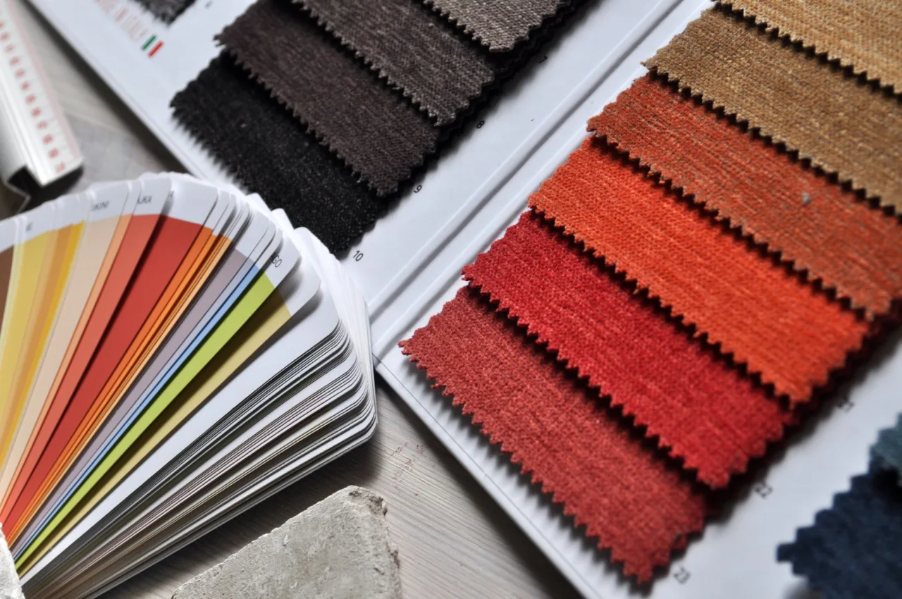
Complementary colours sit opposite each other on the wheel, so they create the strongest contrast. In desi wear these pairings feel celebratory and photograph beautifully under evening light. Classic examples:
- Royal blue and gold: a wedding-guest staple that reads regal without trying too hard.
- Emerald green and deep red or maroon: festive, rich, and forgiving on most skin tones.
- Mustard and teal: a modern favourite for mehndi and daytime events.
- Purple and yellow: bold and youthful, best when one colour dominates and the other appears as trim or dupatta.
The trick with high-contrast pairs is proportion. Let one colour cover most of the outfit and keep the second to roughly a quarter, through the dupatta, border, or contrast sleeves. Equal amounts of two loud colours can look like a costume rather than a considered look.
Analogous and tonal blends: soft and elegant
Analogous combinations use colours that neighbour each other, such as teal with sea green, or peach with coral and blush. Because the hues share an undertone, the eye reads them as harmonious and calm. These are ideal when you want elegance rather than drama: engagements, brunches, office festivities, and daytime Eid.
A close cousin is the tonal or monochrome look, where you build an outfit from several shades of a single colour. Done well, it looks intentional and expensive. We cover this in depth in our complete guide to monochrome outfits, but the short rule is to vary texture and shade so the look has depth instead of reading as one flat block.
Stylist tip
If a two-colour outfit feels slightly boring, do not add a third loud colour. Instead add a metallic (gold, silver, antique) or a neutral (ivory, black, charcoal). Metallics and neutrals count as "free" additions that lift a combination without competing with it.
Neutral-led combinations: the safest sophistication
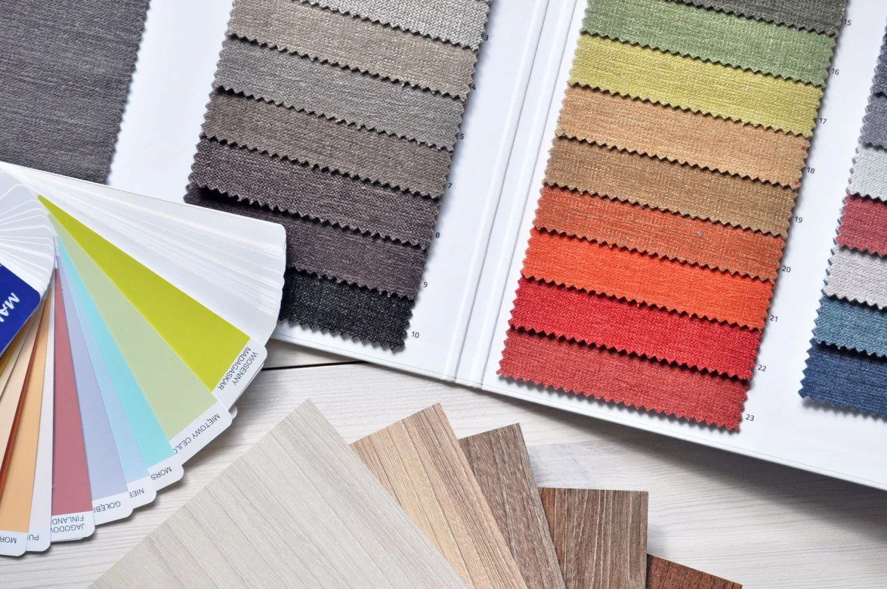
Neutrals such as ivory, beige, black, grey, and off-white are the quiet workhorses of a good wardrobe. A neutral base with one accent colour is almost impossible to get wrong, which is why it dominates minimalist and modest wardrobes. Think ivory kameez with a rust dupatta, or a black anarkali with an emerald border.
Neutrals also solve the problem of busy prints. If your suit already carries a multi-colour print or heavy embroidery, keep the trousers, dupatta, and accessories neutral so the eye has somewhere to rest. This is the same logic that makes a printed lawn suit look tidy rather than chaotic; for fabric-specific advice see our lawn suit buying guide.
Choosing colours for your skin tone
The most flattering palette starts with your undertone, not the trend of the season. A quick guide:
- Warm undertones (golden, olive, or peachy skin) glow in mustard, rust, coral, warm reds, olive, and cream.
- Cool undertones (pink or bluish skin) suit emerald, teal, sapphire, plum, ruby, and true white.
- Neutral undertones can wear most colours; jewel tones such as emerald and ruby are especially reliable.
If you are unsure, hold gold and silver fabric near your face in daylight. If gold flatters you more, you likely lean warm; if silver wins, you likely lean cool. This same test guides your metal choice when you move on to accessories, which we explore in the matching jewellery guide.
Colour by occasion and season
Colour carries meaning and mood, so the event should steer your palette:
- Weddings and formal events: deep, saturated jewel tones (maroon, emerald, royal blue, wine) with gold accents feel appropriately rich.
- Mehndi and daytime festivities: bright, playful pairs like yellow-green, orange-pink, and mustard-teal.
- Eid and family gatherings: pastels in spring or summer, deeper tones in cooler months.
- Office and daywear: muted and tonal palettes, one accent maximum.
Season matters too. Lighter, cooler colours suit summer heat, while burgundy, forest green, and charcoal feel right for winter dressing. For a fuller seasonal breakdown, our guide on the best fabrics for winter dresses pairs weight and warmth with the right tones.
Palettes worth trying this year
Trends come and go, but a few palettes have proven themselves reliable across seasons and suit a wide range of skin tones. Rather than chasing a fabricated "colour of the year", treat these as starting points you can adapt:
- Earthy neutrals: sand, taupe, olive, and terracotta layered together for a calm, contemporary look that photographs softly in daylight.
- Pastel-on-pastel: powder blue with blush, or mint with lilac, for engagements and spring events where you want lightness rather than drama.
- Jewel-tone drama: emerald with wine, or sapphire with gold, for weddings and evening functions that call for depth.
- Ivory with a single bold accent: the most versatile modern combination, where a cream base carries one strong colour through the dupatta or border.
The point is not to copy a palette exactly but to understand why it works, then swap in the specific shades that flatter you. A pastel pairing you love in blue and pink might suit you better in mint and peach. Test combinations against your own skin in daylight before committing, especially for an outfit you will wear in many photographs.
Colour also interacts with fabric. A saturated colour reads deeper in velvet or raw silk and lighter in lawn or chiffon, so the same shade can feel formal or casual depending on the cloth. When you plan a palette, picture it in the fabric you actually intend to buy, not on a screen.
Common colour mistakes to avoid
- Three loud colours with no neutral: the fastest way to look busy. Demote one to an accent or swap it for a neutral.
- Matching everything too literally: shoes, bag, dupatta, and bangles in the exact same colour looks dated. Coordinate, do not clone.
- Ignoring the undertone clash: a warm mustard next to a cool icy blue can feel off; keep undertones broadly consistent.
- Forgetting the metallic: a small dose of gold or silver often resolves a pairing that feels not quite finished.
Quick formula
For a reliable outfit every time, use a 60-30-10 split: 60 percent a dominant colour, 30 percent a secondary colour, and 10 percent an accent through jewellery, shoes, or dupatta trim. It works for lawn suits and bridal lehengas alike.
Frequently asked questions
What colours go well together for a desi outfit?
Reliable pairings include royal blue with gold, emerald green with maroon, mustard with teal, and any deep jewel tone with ivory or black. Keep one colour dominant and let the second act as a supporting colour rather than an equal partner.
How do I pick colours for my skin tone?
Identify your undertone first. Warm undertones flatter mustard, rust, coral, and cream, while cool undertones suit emerald, teal, plum, and true white. A quick test is to hold gold and silver near your face in daylight and see which one brightens your complexion.
Can I wear three colours in one outfit?
Yes, but keep two colours dominant and let the third appear only as a small accent through jewellery, shoes, or dupatta trim. Three equally strong colours usually look busy, so a 60-30-10 balance keeps the look intentional.
Is it acceptable to wear all one colour?
Absolutely. A tonal or monochrome outfit looks elegant and expensive when you vary the shades and textures. Mix a lighter and deeper version of the same hue and add a metallic or neutral so the look has depth instead of appearing flat.
What colours are best for a wedding guest?
Deep jewel tones such as maroon, emerald, royal blue, and wine with gold accents are safe and flattering. Avoid ivory or heavy bridal red at someone else's wedding, since those can read as competing with the bride.
More on Styling Guides
Have a question or a topic to suggest?
We read every message. Tell us what you would like to see next in the journal.
Get in touch